Case Study Layouts That Convert in 2026: A Studio Template You Can Reuse
Most portfolio case studies bury the work under walls of process. Here is the layout structure that actually moves visitors toward enquiry.
The Original Thesis, Revisited
We published Case Study Layouts That Convert with a straightforward argument: most portfolio case studies are structured like process diaries when they should be structured like persuasion narratives. The visitor is not there to learn your methodology. They are there to decide whether to hire you.
That thesis has held up. But the details of what works have evolved. Screen sizes shifted. Attention patterns changed. The competitive landscape moved. Studios that followed generic "case study best practices" in 2024 are now competing with studios that optimised their case study pages as conversion instruments.
This article provides the updated template: the section-by-section structure, the content hierarchy, the performance constraints, and the engagement patterns observed across how effective case study pages are structured and reviewed.
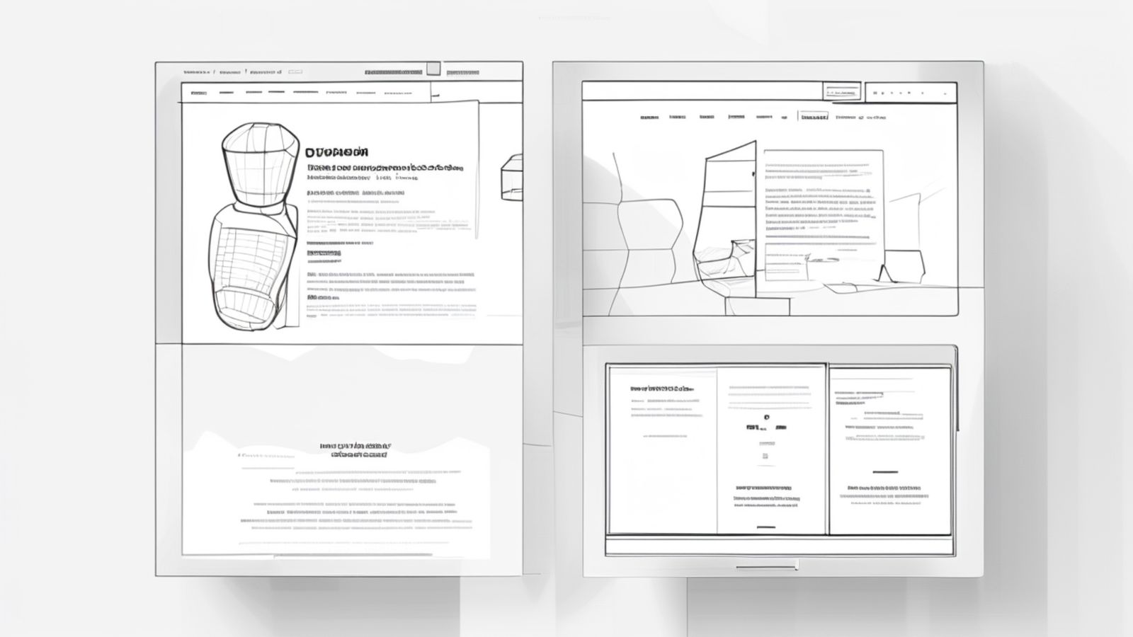
The Layout Template
Section 1: The Hero (above the fold)
Purpose: Communicate what the project is, what it looks like, and who it was for. In three seconds.
Content:
- Project name (H1, prominent)
- Client or brand name
- One-sentence project description (what you built, not how you built it)
- Hero image: a single, high-quality screenshot or photograph of the finished work
- Optional: two or three categorisation tags (Branding, Web Design, Development)
What not to include: Dates, timelines, team lists, technology stacks, or process descriptions. None of this information helps the visitor decide to scroll.
Performance note: The hero image is the largest contentful paint element. It must be optimised for LCP. We covered hero image optimisation in detail in LCP, Hero Images, and Typography. The short version: serve it in WebP or AVIF at the rendered dimensions with proper width/height attributes and fetchpriority="high".
Section 2: The Outcome (first scroll)
Purpose: Show what the project achieved before explaining how you achieved it.
Content:
- Two to four measurable outcomes (conversion rate increase, page speed improvement, traffic growth, accessibility score, user engagement metric)
- Each outcome as a prominent number with a brief label
- If hard metrics are not available (common for brand and identity work), use qualitative outcomes: "Launched across 12 international markets" or "Selected for Awwwards Site of the Day"
Why this comes second, not fifth: The outcome section answers the visitor's core question: "Does this studio get results?" Placing it after the hero and before the process means the visitor encounters proof before methodology. This sequence converts better than the reverse because it establishes credibility early.
Section 3: The Work (the core)
Purpose: Show the work itself in sufficient detail for the visitor to evaluate quality.
Content:
- Full-width images of key screens, pages, or deliverables
- Brief captions explaining what each image shows (not how it was made)
- Alternating layout: full-width image, then image with caption, then image pair
- Video or animated prototype if the project involved interaction design
Density: Aim for five to eight images. Fewer than five feels thin. More than ten creates fatigue. Each image should show a distinct aspect of the project, not minor variations of the same screen.
Image format: Every image contributes to page weight. Each image should be compressed and served in modern formats. Our image compression workflow covers the technical pipeline. For case studies specifically, aim for total image weight under 2MB with lazy loading on all images below the fold.
Section 4: The Approach (the process)
Purpose: Briefly explain how you solved the problem, for visitors who want to understand your thinking.
Content:
- Two to four paragraphs covering the challenge, your approach, and key decisions
- No more than 400 words total
- Focus on decisions and trade-offs, not activities. "We chose a single-page architecture because..." is more useful than "We conducted user research and created wireframes and..."
Why this comes after the work: A portfolio visitor who has seen the outcome and the work already has a positive impression. The approach section reinforces that impression with evidence of thoughtful process. But if the approach came first, the visitor would be reading about your process before knowing whether the output is any good.
Section 5: The Testimonial (social proof)
Purpose: Third-party validation.
Content:
- A direct quote from the client, ideally three to five sentences
- The speaker's name, title, and company
- A headshot if available (adds credibility)
If no testimonial is available: Skip this section entirely. A fabricated or heavily edited testimonial is worse than none. Replace it with a brief "scope of work" listing deliverables and timeline.
Section 6: The Next Step (conversion)
Purpose: Move the visitor from admiration to action.
Content:
- A clear call to action: "Start a project" or "Get in touch"
- Navigation to the next case study for visitors who want to see more work
- Both options visible simultaneously
Why not just a contact link in the nav? Because the visitor who has scrolled through an entire case study is in a different state of mind than the visitor who just arrived. They have seen your work. They have seen results. They are primed to act. The CTA at the end of the case study meets them at their moment of highest intent.
Content Principles
Write for scanners, not readers
Observed patterns in case study page behaviour show the same tendency: visitors scroll quickly through case study pages, pausing at images and headlines but rarely reading body text in detail. The text exists for the 15 to 20% of visitors who read carefully. The images and headlines must carry the message for everyone else.
This means:
- Headings that communicate meaning, not structure ("Revenue increased 34%" not "Results")
- Captions that summarise the design decision visible in the image
- Bold key phrases in body paragraphs so scanners catch them
- No paragraph longer than four sentences
Lead with specifics, not generalities
"We redesigned the homepage" tells the visitor nothing. "We replaced the five-panel carousel with a single hero image and reduced bounce rate by 23%" tells them something meaningful. Every statement in a case study should include a specific detail: a number, a technology, a constraint, a decision.
Strip the ego
Case studies that say "our world-class team leveraged cutting-edge technology" communicate insecurity. Case studies that say "we built the site with Next.js and deployed to Cloudflare" communicate competence. Specific, factual language is more persuasive than superlatives.
Performance as a Conversion Factor
A case study page that takes four seconds to load on mobile loses visitors before they see the first image. Performance is not separate from conversion. It is a prerequisite.
Target metrics for case study pages:
- LCP under 2.5 seconds on 4G
- CLS under 0.1
- INP under 200ms
- Total page weight under 3MB (including all images)
- Time to interactive under 3 seconds
These targets are achievable with proper image optimisation, lazy loading, and a static export architecture. We covered the broader performance framework in Core Web Vitals for Portfolio Sites in 2026.
Responsive Considerations
Case study layouts must adapt to mobile without losing their visual impact:
- Full-width images scale naturally
- Image pairs stack vertically on narrow viewports
- The outcome metrics section adapts from horizontal to vertical layout
- The hero image does not get cropped into meaninglessness on small screens
Test the case study on a real phone, not just a browser resize. The 375px viewport in DevTools does not capture the experience of scrolling through images on a real device with real network conditions.
The Template in Practice
The studios producing the most effective case study pages in 2026 share these characteristics:
- Hero to outcome flow that communicates value in under five seconds
- Five to eight curated images rather than fifteen exhaustive screenshots
- Under 500 words of body copy total
- Page weight under 2.5MB
- Clear CTA at the bottom that converts the admiration into action
The template is deliberately simple. It does not need parallax scrolling, scroll-triggered animations, or interactive data visualisations. It needs clear images, clear outcomes, and a clear path to contact.
Structure is the conversion lever, not decoration. The studios that understand this consistently outperform the ones that are still building case study pages as process documentation.