now loading: monotonomo_journal
Design,
interface,
craft.
Monotonomo is an independent design journal and studio-in-progress. We publish concept studies, editorial explorations, and interface experiments — documenting design thinking across visual systems, front-end craft, and digital product work.
Approach
Principles,
not templates.
Structure first
Every project starts with information architecture and content hierarchy. Visual design follows structure, never the other way around.
Typographic precision
Type systems do the heavy lifting. We build deliberate scales, pairings, and rhythm into every project rather than styling text reactively.
Performance as design
Page weight, load sequence, and rendering performance are design decisions. A beautiful interface that loads slowly has already failed.
Restraint over decoration
We add elements when they earn their place and remove them when they compete for attention. Every pixel should be pulling its weight.
Visibility
Search,
considered.
Structure that search engines respect
Good SEO starts with good architecture. Semantic HTML, clean URL hierarchies, and well-formed metadata are not afterthoughts — they are part of how we build every site from the outset.
Performance is a ranking signal
Core Web Vitals directly influence organic reach. The same discipline we apply to interaction design — minimal layout shift, fast LCP, low INP — also happens to be what Google rewards.
Content built to be found
From structured data and canonical tagging to editorial planning, this journal covers how to build content that earns visibility over time. For teams evaluating how AI fits into that workflow, an honest ai seo tools comparison is a useful guide before committing to any platform.
From the Journal
All entries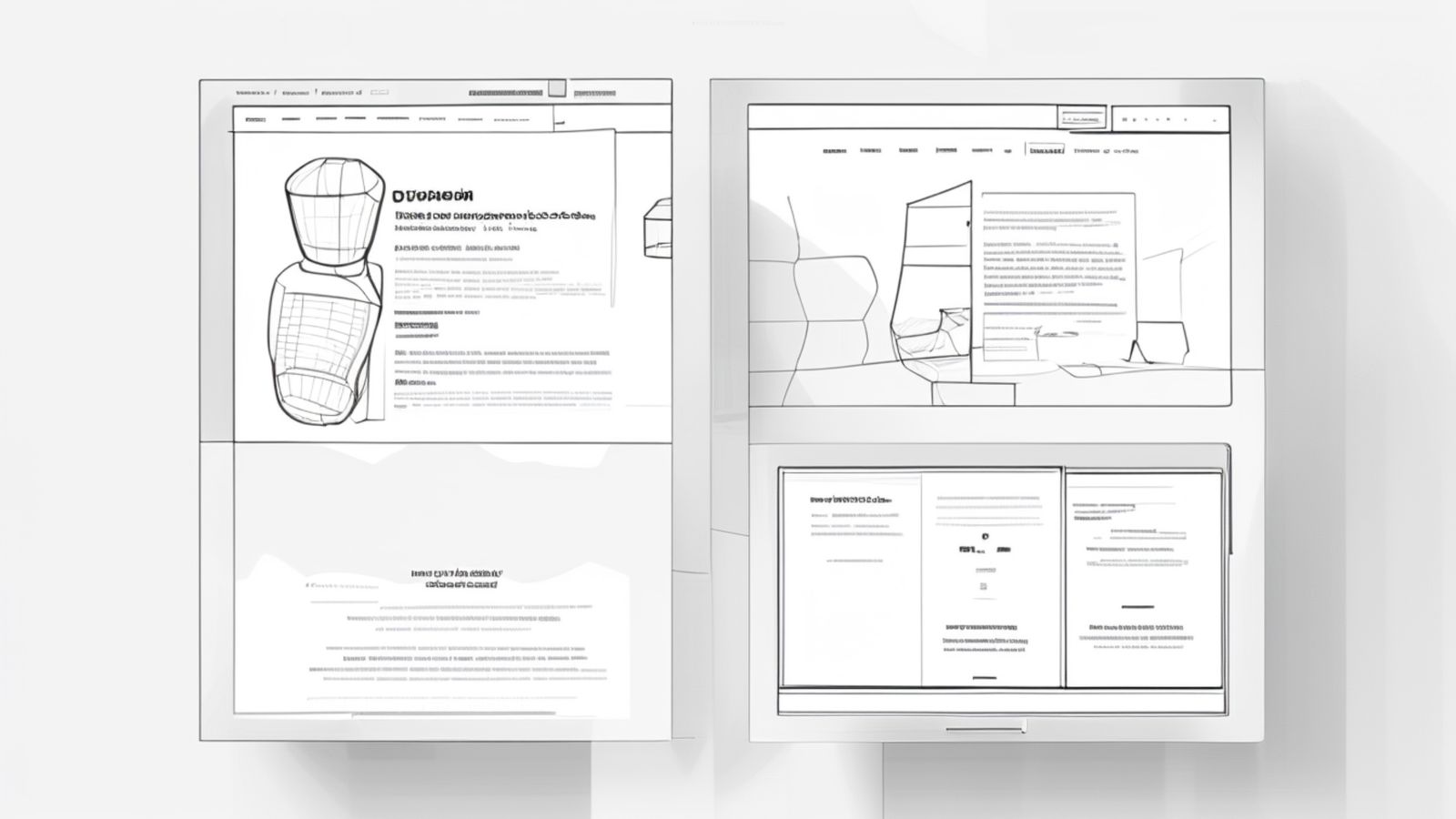
Case Study Layouts That Convert in 2026: A Studio Template You Can Reuse
Most portfolio case studies bury the work under walls of process. Here is the layout structure that actually moves visitors toward enquiry.

Design System Governance for Small Teams: The Minimum Structure That Prevents Drift
Small studios do not need design ops. They need three habits that prevent their system from drifting into inconsistency.
Design Tokens for Small Studios: What to Tokenise (And What to Leave Alone)
Most token systems are over-engineered for studio-scale work. Here is the minimum viable set and why adding more usually makes things worse.
now loading: enquiry_prompt
Have a project in mind?
We take on a small number of projects at a time to give each the attention it deserves. Tell us about what you are working on.
Get in touch